

Customize status page appearance and branding
The Appearance tab styles a status page to match your product and decides what visitors see on it: branding, colours, layout and a set of display switches grouped into presets. A Live preview redraws with your own monitors as you change things; nothing goes public until you click Save changes.
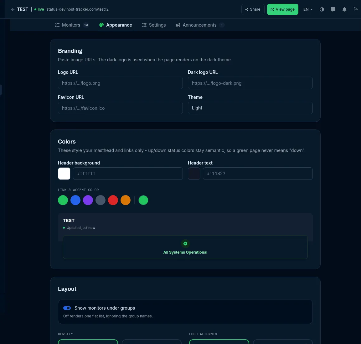
Settings reference
Section titled “Settings reference”| Setting (UI label) | Group | API field | Allowed values | Default | What it does for you |
|---|---|---|---|---|---|
| Logo URL | Branding | settings.logoUrl |
Absolute http(s) URL to an image you host, up to 500 characters |
none | Your logo in the page header. |
| Dark logo URL | Branding | settings.darkLogoUrl |
Same | none | The logo used when the page renders in the dark theme (typically a light logo on transparent). |
| Favicon URL | Branding | settings.faviconUrl |
Same | none | The browser-tab icon. |
| Theme | Branding | settings.theme |
Light (light) / Dark (dark) |
Light | The page’s colour scheme. |
| Header background | Colors | settings.headerBgColor |
#rrggbb |
navy #0f1b2d |
The masthead background. |
| Header text | Colors | settings.headerTextColor |
#rrggbb |
default | The masthead text colour. |
| Link & accent color | Colors | settings.themeColor |
Swatches (Green (recommended), Ocean, Violet, Slate, Crimson, Amber) or a custom #rrggbb |
green | Links and accents. |
| Density | Layout | settings.density |
Wide (wide) / Compact (compact) |
Wide | Compact uses tighter rows and a smaller logo. |
| Logo alignment | Layout | settings.logoAlignment |
Left (left) / Center (center) |
Left | Where the logo and page name sit in the header. |
| Show monitors under groups | Layout | settings.showGroups |
on / off | on | On lists components under their group names; off renders one flat list. |
| Preset and the switches below | What visitors see | not in the API | Minimal, Standard, Full, Custom | Standard | What the public page shows. |
Colours style your masthead and links only. Up/down state colours stay fixed, so a green page never means “down”.
Change it in the app
Section titled “Change it in the app”- Open Status pages, click Edit on the page and go to the Appearance tab.
- Under Branding, paste image URLs and pick a Theme.
- Under Colors, set Header background, Header text and Link & accent color.
- Under Layout, choose Density, Logo alignment and Show monitors under groups.
- Under What visitors see, pick a Preset or flip individual switches (the preset then reads Custom; Reset to Standard goes back).
- Check the Live preview, then click Save changes.
What visitors see
Section titled “What visitors see”The presets: Minimal shows the state and the uptime bar; Standard is what most pages need; Full shows every metric. Touching any switch makes the preset Custom. The switches, with their Standard values:
| Group | Switch | Standard | What it controls |
|---|---|---|---|
| Header | Subscribe button | on | The subscribe button in the header and footer. Off hides both; email and feeds stay reachable from footer links. |
| Header | Time zone switch | on | Lets a visitor flip between local time and UTC. Off shows every time in UTC. |
| Header | “Updated” stamp | on | How fresh the page is, next to the subscribe button. |
| Status card | Services-up count | on | “12 / 15 services up” on the status card. |
| Status card | “Since when” on the card | on | Names the affected services and how long they have been down. |
| Status card | Next-update line | on | While an incident is open, the time you promised for the next update. |
| Status card | Report “not confirmed” separately | on | A monitor with no recent result counts as neither up nor down. Off counts it as its last known state. |
| Services list | Search box | on | Shown when the page lists 10 or more services. |
| Services list | State filter | off | The All / Down / Not confirmed / Operational / Paused control with counts. |
| Services list | Collapse groups that are all operational | on | A group opens on its own when something in it is not green. |
| Services list | Order rows by state | on | Down first, then degraded, not confirmed, maintenance, operational. Off keeps your own order. |
| Services list | Paused monitors | Behind “Show paused” | Hide, Behind “Show paused” or Inline. |
| Services list | Third-party services | on | Rows whose state you set by hand. |
| Services list | Monitor addresses | off | The URL under each service name. |
| Services list | Uptime % on every row | on, 90 d | One uptime window to the right of the name (24 h, 7 d, 30 d or 90 d). |
| Services list | Uptime bars | on, 90 days | One tick per day; 30, 60 or 90 days (phones always show 30). |
| Services list | State icons in dots | on | A glyph in every dot, so state never depends on colour alone. |
| Metrics | Overall uptime strip | 24 h, 7 d, 30 d, 90 d | The monitored services together, third-party excluded. |
| Metrics | 100%-day streak | on | Consecutive days without an outage, under the strip. |
| Metrics | SLA target | - | Shown as a chip and drives the error budget; set it on the Settings tab. |
| Metrics | Error budget | on | For example “1 h 12 min used of 43 min allowed” for the last 30 days. |
| Metrics | Monthly SLA history | on | The 12-month table and CSV export. |
| Metrics | “How is this calculated?” link | off | A link explaining the uptime maths. |
| Metrics | Response time | on | Response-time charts: ranges 24 h, 7 d, 30 d; statistics Average, Slowest, Fastest. |
| Service pages | Service pages | on | The per-service page each row links to (sections: uptime windows, bar, response time, events). Off makes rows plain text. |
| Incidents | Active incident panel | on, latest 2 updates | The open incident under the status card with its timeline (Latest, Latest 2 or All updates). |
| Incidents | “Subscribe to this incident” | on | A subscribe link on the incident panel. |
| Incidents | Outage details | off | HTTP code, first failing location and the hour bar in “What monitoring saw”. |
| Incidents | Monitoring-detected outages | on | Outages nobody wrote a post for, marked as detected automatically. |
| Incidents | Past incidents on the hub | Last 30 days | Off, Latest 5 or Last 30 days. |
| Incidents | History page | on | The full, filterable incident history. |
| Footer and feeds | RSS and Atom feeds | on | Feed links in the footer. |
| Footer and feeds | status.json link | on | A link to the machine-readable status. |
| Footer and feeds | Powered by HostTracker | always on | The footer credit; it cannot be turned off. |
Some switches are marked Coming soon in the editor (the p95 statistic, the 90-day response range and per-location response lines) and show once the data is collected.
What you hide here is hidden in status.json and on the badge too - a metric you do not show is not published at
all. A few of these switches share state with the Features switches on the Settings tab (bar charts, outage
details, details pages, monitor URLs, hidden paused monitors, overall uptime) - see
Create a status page.
Do it with the API
Section titled “Do it with the API”Branding, colours and layout are members of the page’s settings object. PATCH /statuspage/{id} (scope
statuspage:write) changes only the members you send; null clears one:
curl -X PATCH https://api2.host-tracker.com/statuspage/PAGE_ID \ -H "Authorization: Bearer $HT_TOKEN" \ -H "Content-Type: application/json" \ -d '{ "settings": { "logoUrl": "https://cdn.example.com/logo.svg", "darkLogoUrl": "https://cdn.example.com/logo-white.svg", "theme": "dark", "themeColor": "#3b82f6", "density": "compact", "logoAlignment": "center", "showGroups": true } }'The What visitors see preset and its switches are set in the app only; the API exposes the older features list,
which covers part of them.
With MCP, update_status_page takes a settingsJson object (a JSON string). It is merged like the API’s PATCH:
send only the members you change - the others keep their values. The exception is features, which replaces its
whole list, so send every feature you want on. (The tool’s own description says it replaces the settings object;
the API merges.)
The HostTracker credit
Section titled “The HostTracker credit”Every public status page, embed card and badge carries a small “Powered by HostTracker” credit in the footer. It is
shown on all plans and cannot be removed; the old hideBranding setting is accepted by the API but has no effect.
Your own logo, colours, homepage link and (from the Webmaster band) your own Google Analytics ID and SLA target are
what make the page yours.